Erion Website
The Proposal
Challenge
While Erion's art can be found on different platforms, there is no centralized location where Erion is able to showcase his portfolio. In the initial kick-off meeting Erion expressed that he has lost out on multiple opportunities due to lack of an accessible, centralized location to showcase his art.
Key Objective
An accessible, user-friendly prototype for Erion to showcase his artwork and extended portfolio to a wider known and unknown audience.
Solution
The solution to this project is to create a fully functioning and accessible prototype where Erion is able to showcase his portfolio. Erion wishes to showcase his art to like-minded individuals and acquaintances and increase sales as a by-product of better exposure.
Process
Research
To achieve the expected outcomes the design thinking process and the CMD research methods was used to collect data.
Main question
What would a showcase of Erion's portfolio and personality look like, and how can that be incorporated into a website?
Sub questions
The empathize phase involves working with people in order to try and understand them.
- What is Erion's personality like?
- How does Erion interpret his own art?
- How would he like to represent himself on the website?
- How did he get interested in the art that he creates?
- What is Erion's personality like?
The define phase is all about bringing clarity and focus to the design space.
- What kind of art is in, and how big is Erion's portfolio?
- Does he want his art explained or left up to the viewer's interpretation?
- How will the data obtained on users be analyzed?
- How will data be collected to better understand users and their preferences?
Ideate phase is where you concentrate on idea generation to create solutions for our users.
- What feel does he want to give the users of his website?
- What are some stylistic choices he wants to see on the website?
- How did he get interested in the art that he creates?
- How can other websites be used as a source of inspiration to create a quality portfolio for the client, Erion?
- How can Erion's portfolio be created in such a way to stand out from others in the market?
- How will all the requirements be identified?
The prototype mode is the iterative generation of artifacts intended to answer questions that get you closer to your final solution.
- How would he like to represent himself on the website?
- How will we ensure that the final portfolio meets the requirements of the client?
The test phase is to get feedback about the prototypes you have created. Show them to your users and have another opportunity to gain empathy for the people you are designing for.
- How often should Erion be contacted for progress updates?
- How will we ensure that the final portfolio meets the requirements of the client?
- How will all the requirements be identified?
- How will we ensure a satisfactory end product?
- How will we ensure a satisfactory end product?
Empathise phase
Interview Summary with the client
This first interview with our client was to get to know him better and what his ideas are. Erion is an artist who is creative and is always trying to do different things. He creates paintings, sailboats, sculptures, and clocks. He classifies himself as something in between an artist and engineer. He is a teacher and loves mathematics. Most of his art works are problems that he creates himself, he then tries to solve those problems. He is open to new or different ideas based on what we see fit.
In terms of some color choices, he likes the color white and a combination that he doesn't mind is white a little red or black or gray. He likes a darker red, in his words: “The color you get when you put the color in the oven.” Erion really likes minimalistic designs, even some of his paintings are white on white. He says “Let's say when I take out all the colors and tones, the tone is from white to black and color is color, somehow in my mind the white stays. Because like the white canvas you start with is the empty thing and is less.” So, this is something he connects with.
And some website specifications are he would like all his art separated into different html pages based on art type. He also wants one page, the main page, to have his current artwork. And after a certain number of posts, it should automatically go into the designated page. On the website he also wants his CV and a short about me section. He wants a page that is catered to selling his work, which is something that he did not initially want. However, the whole website should not be focused on selling, he just wants something that is easy for customers to purchase.
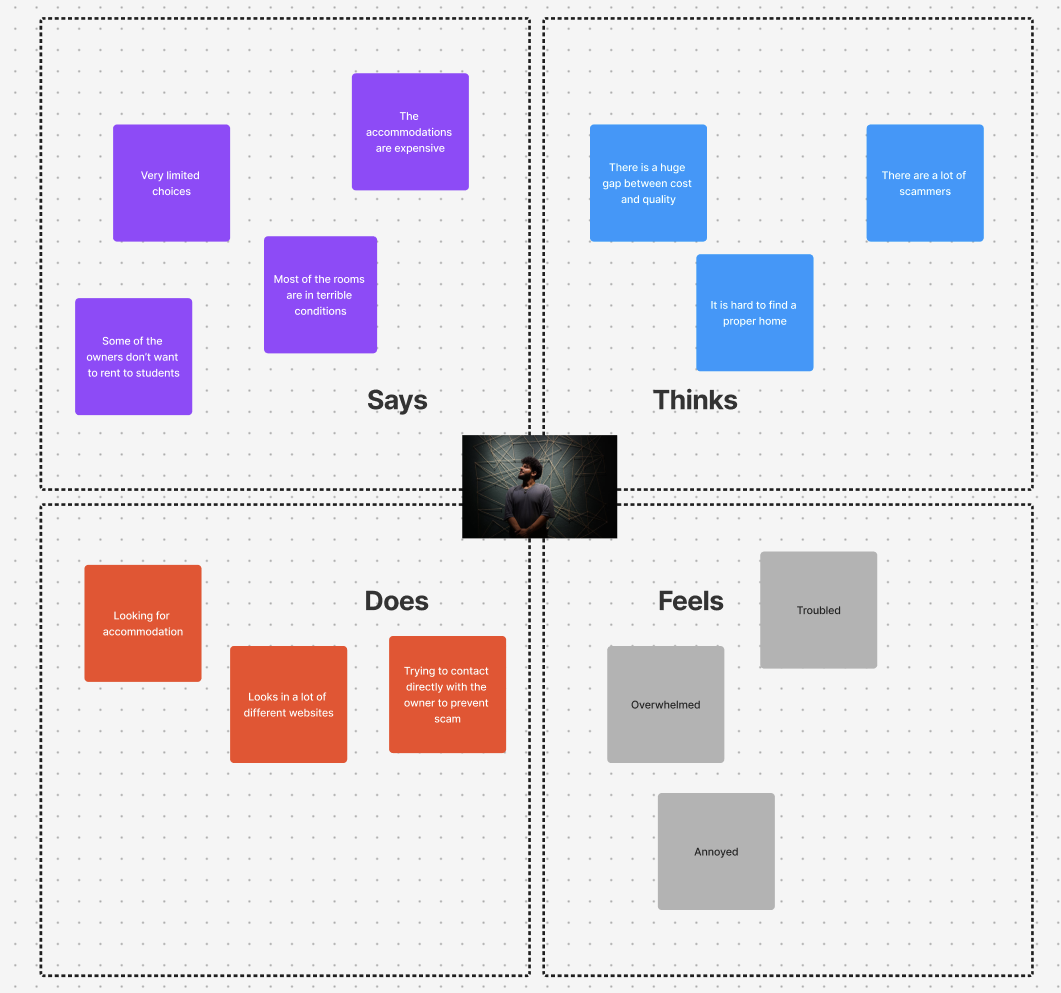
Empathy Map
For the Empathy map we used the data that we got from the interview with our client. The empathy map was used to visualize all that we know about our client. The information is categorized in four sections. For “says” we added the things he said he wanted on the website. For “thinks” we added things that came to his mind. For “does” we added things he does. For “feels” we added the way we think he feels.
Define Phase
Survey 1 results
The purpose of this survey was to gather insight in people's art interests and art purchasing habits. This is important to us to find out whether people have a genuine interest in art and whether they would be open to purchasing it through a webshop. Along with finding out whether Erion's art would be of interest to the public. Results have been gathered from 62 respondents. The survey results come from different online communities and people at the Weert and Eindhoven train stations. Some basic information has been gathered along with more personal interest's data
The majority of responses we received were from the 18-24 age range, with 48.4% of results. The second largest demographic was the 25-30 demographic with 24.2%. This connects to the yearly income, where the majority of respondents answered that they earn less than €20.000 a year, with 62.1% of results. Regarding art interests, respondents answered broadly, having a wide interest in different art styles. The majority of respondents have an interest in photography, paintings, digital artwork and drawings. The least interesting art styles are sculptures and interactive media. Among the respondents, 67.7% answered they in fact own art. 50% of the respondents answered they purchased art, implying some art was obtained for free. When buying art, most of it is purchased either online or directly through artists. The least common purchasing option/place is an art gallery. One of the final questions that was asked was whether respondents would think buying art online would be more preferred. Out of 62 respondents 36 responded saying they agree to a degree. 15 were neutral on the statement and 11 said they do not agree to a degree. The final question we've asked was whether respondents create art themselves and if so, what type. This question received 42 responses where most people create (digital) drawings, some do photography, and some do music.
User scenario
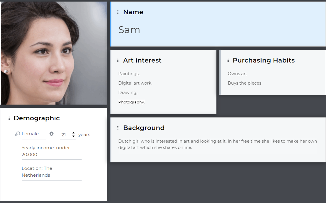
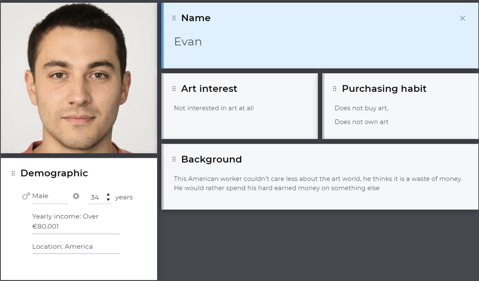
We created two scenarios: Sam and Evan. We created them based on the personality from the personas. It helped us understand the user and what they want from the product. Evan dislikes art but visited the website and was interested in the clock collection but found it overpriced so he decided to look in IKEA instead. While Sam, who is interested in arts, browsed through the website and ended up purchasing a painting. She also had a nice experience with browsing and purchasing on the website.
Evan
As Evan arrives at the homepage, he sees a banner displaying some of the newest pieces of art made by the artist. He finds the artwork intriguing and clicks on the "Paintings" category in the navigation bar to see more. He is directed to a page displaying various styles of paintings including landscapes, abstracts, and portraits. Evan clicks on the "Portraits" category and scrolls through the page, where he sees a variety of portraits. Next, Evan clicks on the "Clocks" category and is pleasantly surprised to see a collection of unique and creative clocks. He finds the idea of combining art with functionality interesting and spends some time admiring the details of each clock. Evan clicks on the "Boats" category and is impressed by the intricate details and craftsmanship of the ship models. He reads the brief descriptions of each model and learns about the inspiration behind the artist's work. After looking though, the boats page Evan gets intrigued by the painting page and decides to scroll through it. Because of the functional aspects after looking at the “Boats” and “Clocks” page. Going back to the clock page he looks back at the “clock” page after scrolling for some time he finds the clocks to be overpriced so he leaves the site and goes to the site of IKEA to look at cheaper clocks.
Sam
Sam navigates to the homepage. The page loads quickly, and Sam is impressed by the clean and modern design that showcases Erion's artwork beautifully. Sam notices that there are five different categories to choose from: Paintings, Clocks, Boats, About Me, and Buy Art. She decides to start by exploring the paintings and clicks on that category. The page loads quickly, and Sam is greeted with a variety of paintings in different styles and colors. She clicks on a painting that catches her eye and is presented with a more detailed view of the piece, including its title, size, medium, and price. Sam likes the piece and decides to see more of Erion's work, so they click on Boats button to go to the boat page. They continue scrolling through the different pieces, clicking on some and skipping others, until they find another artwork they really like. Finally, Sam decides to make a purchase. She clicks on the "Buy Art" link in the navigation bar and is taken to a page that displays all the artwork available for purchase on the site. She finds the painting she liked earlier and clicks on the "Add to Cart" button. Sam is taken to a checkout page that displays the painting, its price, and the total cost including tax and shipping. She enters her shipping and payment information and clicks the "Submit" button to complete her purchase. She receives a confirmation email and eagerly awaits the arrival of her new artwork. Overall, Sam had a positive experience browsing through the different categories on the website and making a purchase. The clean and user-friendly design made it easy for her to navigate and find what she was looking for, while the detailed views of each artwork helped her make an informed decision.
Persona
Sam
Evan
Ideation phase
Survey 2
The purpose of this survey was to gather insight into people's interests and preferability on a website. This is important to us to find out because with this information we can decide on how to structure the website. Some basic information was gathered along with more personal interest's data and there were 27 respondents.
The majority of responses we received were from the age range 18-25, with 66.7% and the second largest demographic was the 41+ demographic with 11.1%. Regarding the question of what people look for in a website, there were two answers that got the same number of votes. Which were usability and information with an average of 33.3%. The second largest was Aesthetics(look) with 25.9%. There were two suggested responses which were all of the above and that the website must have a vibe. Lastly there was an option between a simple design or an intricate design of what you prefer the structure to be on a website. The majority chose a simple design (77.8%) and the other an intricate design (22.2%).
Competitor analysis
Almost Real.me (Camus,2014)
Artist collective, shop function separated into multiple different art styles. Main page has some art showcased, with prices included. Short tiny blogpost about upcoming items with links for more information. Featured artist “banners” including interview. Social media showcase at the bottom, newsletter subscription. Sitemap included. Clean design, image carousel for items. White/black main color scheme. In general, more of a web shop for featured artists. With art separated by style/ vibe?
Kate Vass Galerie (Galerie,2017)
An art galerie, featuring a big collection of artists. Focus is on selling and showcasing featured artists and their artwork. High-end prices. Modern design featuring moving aspects. Mainly black and white website. Quite extensive blog posts, in the form of a carousel just like the art. small collection of exhibitions.
Sophie Kahn (kahn, n.d)
Sleek, limited frontpage, featuring a carousel of sculptures and other art. Footer has a newsletter subscription, social links and copyright. Artwork is separated through a menu. Extensive about page. Digital artist and sculptor combination. Multiple art degrees. Focus seems more on herself in combination with a showcase of her art. No shop function included. Once more a sleek, minimalist design with black/white.
Maegan Guerette( Guerette, 2004)
Painter and photographer with a more colorful design through her art. Includes a collection of different styles. Short “about” page. No shop function but is open for commission work through e-mail contact. Navigation is wonky, duplicate nav-bar for header and footer. Layout mostly done in a flexible grid-style.
Andrea Manning Art ( Manning.n.d)
White website with black tones. The overall website is very simplistic with a focus on the art pieces that have been put online. The navigation bar is on the side with her social media links as well. However, the links there are very small. The website does have a zoom in button that allows you to look at the website. The contact page is very basic.
Jason Arkles (Arkles, n.d)
It is a very simplistic website with a sculpture vibe. The index is a massive hero picture with a nav bar in the middle to allow you to locate his art or somewhere else. Everything is separated into multiple aspects to navigate in an easier way. It is white with black tones. Nothing is in the footer, he put all his links in the header. In his contact page basic information has been put in, the input of a map of where he lives is a nice function. His about me page is filled with text and a small photo of himself. Overall, this website is not great to look at, do not recommend looking at this website for reference.
Emily Mercedes (Mercedes,2018)
Simplistic design, more of a shop website than anything. White background with black tones. The navigation bar is separated into multiple segments for easy navigation. Looks a bit old school. Footer is very big with an odd font to make it hard to read. The shop basket is a bag which is a nice feature. The click to view the artwork with the small hover is a small nice feature.
Edzerza Gallery (Edzerza, n.d)
Nice website with a good shopping function, artist artworks are nicely on display. Hover to showcase the prices are well input. Tiny about me in the beginning on the index page. Navigation bar is very clear. His social media is at the bottom; customer service has been added which is a nice feature. Payment methods are at the bottom too. Black and white theme. Account creation and login has been put into place. Sculptures and other art pieces are separated very nicely, search button.
Strengths & weaknesses
The table makes use of a scale from 1 to 10, 1 being the worst and 10 being the best.
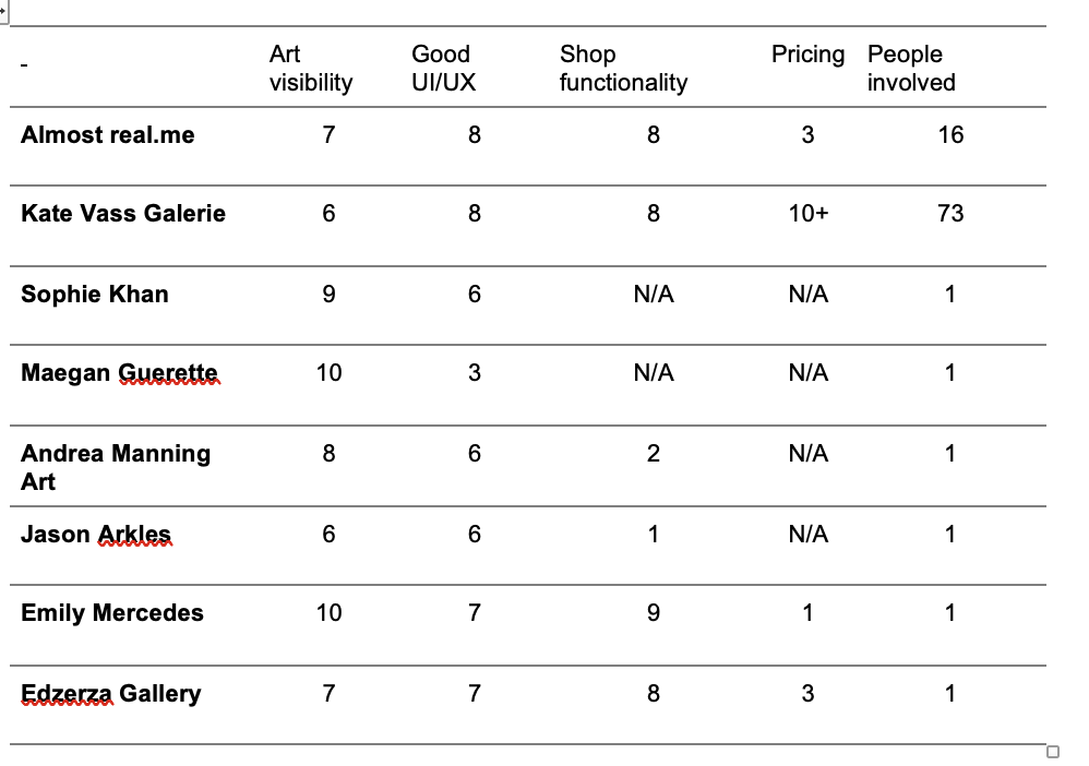
What is our competitive advantage?
Erion has a wide price range for his art. Making it very available to the general public, as well as more dedicated art enthusiasts. Art will be at the center of our website. Erion creates very unique art, using different tints of white to create complete images. Good visibility is something we strive for in creating our website for Erion. A clean and good user interface and experience will be required to stand out among others. A good-looking shop will also be key to making this website a success.
Prototyping
In this phase we analyzed our research and created our prototype. There are some sub questions that need to be answered. We conducted two CMD methods, which are a mood board and a prototype. We made a mood board to visualize ideas and the personality that represent our client. He would like to present himself as a minimalistic person and a problem solver. For our prototype we did multiple variations and then combined them with the opinion from our client.
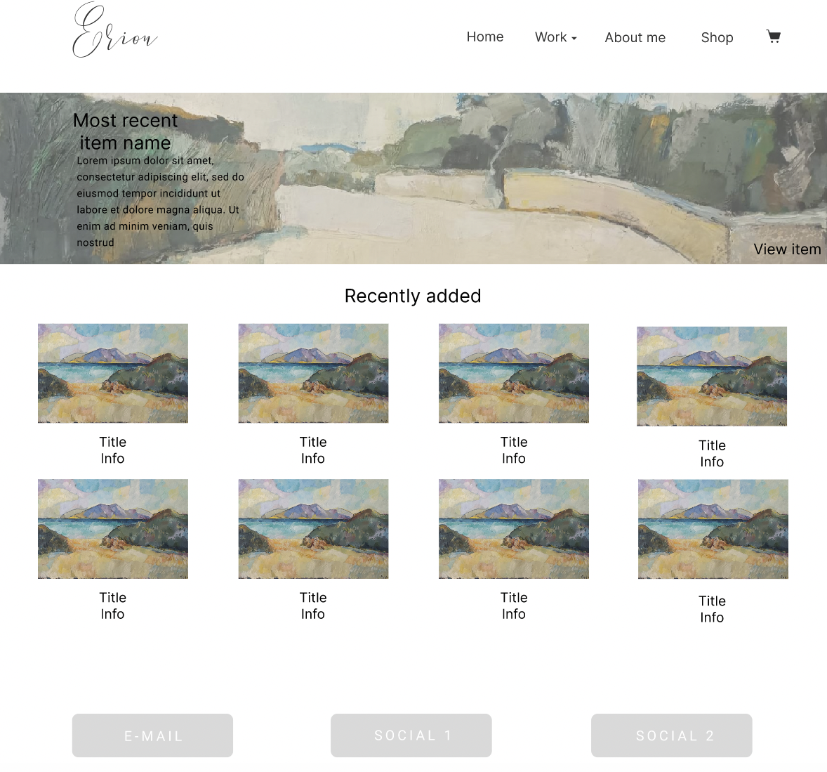
Figma prototype
Figma prototypeThe layout of our prototype is that it has multiple pages. In the navbar you can find the about me, shop and cart page. There is also a drop-down menu where the different types of art have their own section/page. In the footer the client's socials and other platforms can be found. On the homepage his recently added art can be found.
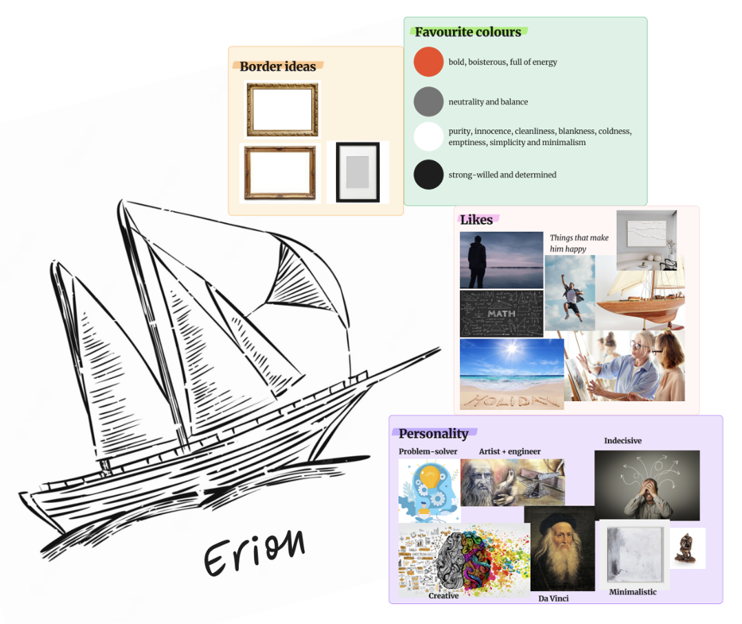
Mood board
The mood board is based on the results we got from the interview with Erion where we questioned him about his personality, likes, dislikes and leisure time activities. The mood board was used as one of the research methods because it helps organize the inspiration of the project. It helps keep the style and aesthetic within the project consistent. In this mood board you can see some border ideas we have for the actual website, the colors we're going to use and all the inspiration that Erion gave us in the interview. Erion likes being alone, mathematics, freedom, holidays, teaching, modeling boats and white on white art. Erion sees himself as Da Vinci, a problem solver, creative, minimalistic and an artist and engineer in one. From the interview we've gathered that he can be quite indecisive and therefore also added that into the mood board. Erion is very talkative when it comes to talking about things, he's very passionate about and could entertain you about those subjects for hours.
Testing
Interview with client
This second interview was held to show our client all the research that we did and to show him our ideas. Each group member was assigned to create an individual prototype to visualize their ideas of how they think the website should look like. We showed him our survey, mood board, empathy map, personas, and the individual prototypes. He was impressed with the results that we got from the survey and with all the research overall. We asked him if he saw himself in the mood board. The mood board and empathy map indeed represent him, but he didn't like the color that we chose for the website. We chose an orangish-red, so we need to change the color to a darker red.
Interview with users
We conducted 3 interviews and with them the intention was to test our prototype to get an idea from the user if it's user-friendly and to get their opinion. The age from the 3 interviewees was between 19-21. Most of them are interested in art. Their expectation of an art portfolio website is that it should have art displaying, in a portfolio format, brief description about the art, some personal information of the artist and not so much functionality. Two users were a bit confused in finding the painting page and the other the cart page. However, it was more how the question was asked.
The feedback that we got back is that design wise it should pay more attention to the brand of the artist. The cards should be bigger because they look too busy. Also, the drop-down menu where all the different sections are located which is called work to give it a better name because it kind of confused him when he got the task to go to the painting page. Additionally, they like the layout, it reminds some of Amazon. However, they said that it is clear and accessible.
A/B testing
We conducted the AB testing to finalize the research and to better the useability of the website. We got 10 individuals to conduct this and did it in an interview form. So, on the cart option it's clear the interviewees like the icon over the name. When it comes to the drop-down menu of the work page, they prefer the classic arrow on the right over a different placement or the hamburger menu. Then there's the detail page when you go to check out with your cart and payment information. The interviewees prefer the page with more white space over the close placement of the sections. Next, we have the titles Shop and Paintings/item name. Both titles were preferred to be in the middle with small adjustments such as making it more centered and a bit lower. At last, when you click on an item there will be either a pop-up or a new page and they prefer an external page.
Result
Figma prototypeOther Projects